• You are not logged in.

efficient touch screen input?

  • Started by ghen
  • 176 Replies:
  • Reputation: 23
  • From: Belgium
  • Registered: 26-Feb-2008
  • Posts: 482

Hi,

This is not really on-topic on the Colemak forum, but I figure people here may have interesting thoughts/opinions on this.

I recently jumped on the bandwagon and purchased an Android smartphone.  After some initial dabbling with Qwerty, Colemak, T9 and Swype keyboards, I decided none of these are very efficient on a touch screen, particularly on a small 4" one.  So I'm looking for alternatives.

There are plenty of "improved" keyboard apps available, for free or $$$, but most are just modifications/hacks/tweaks/improvements of the above, not fundamentally better (despite big claims and marketing statements).  Two radically different alternatives caught my attention though, as they are specifically designed for touch screens: 8pen and MessagEase.  I'm currently playing around with MessagEase, as it's a free download whereas 8pen is not.

In a nutshell: it's a matrix with 9 big keys, and a big space bar underneath.  Tapping the 9 keys gives you the most frequent letters: ANIHORTES, the others are formed by "sliding" between keys (left/right, up/down, diagonally, and even back & forth).  Visually:
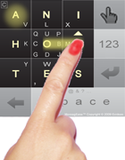
principle.png

My impressions so far:

PRO
+ designed from scratch specifically for touch screens, not improving on fundamentally inefficient methods
+ letter placement makes sense at first sight, most frequent letters require the least effort
+ large keys, especially the most frequent letters cannot be mistyped
+ there's a learning game with several levels and a speed test available
+ includes and even encourages a "blind" (unlabeled) keyboard mode, no hunt 'n peck!
+ many special characters available directly on corner keys (actually usable on a unix console!)
+ somewhat configurable, can implement "macros", but not change the layout
+ has a left-handed mode (putting the control keys on the left side)
+ several non-latin layouts (Russian etc) available as well

CON
– need to learn to type from scratch once again (but I actually wanted something completely different, right?)
– susceptible to typos by not clearing the finger enough between characters? (whereas eg. 8pen uses uninterrupted swipe patterns)
– patented, so no alternative implementations possible
– free download today but will it remain free?
claims to be based on scientific research, but no white paper, no statistical evidence, not even arguments for the actual letter placement, are provided edit: there is a white paper
– little or no independent research
– will it even still exist two years from now? edit: already exists since 2003, so seems good

Thoughts?  Experiences?  Other alternatives?

Last edited by ghen (01-Dec-2012 22:12:13)
Offline
  • 0
  • Reputation: 214
  • From: Viken, Norway
  • Registered: 13-Dec-2006
  • Posts: 5,361

Rather like what I had in mind: A DataHand-like implementation for touch screens. I wonder if the patent on MessagEase would preclude that?

What I thought up would be based on Colemak (or the layout of your choice), giving you a button for each home position key on one hand that can then be "leaned" to the side for its bottom/upper/top row counterparts. I was thinking 6 buttons in a row - 2 columns for the index and pinky fingers more or less like there are on a standard keyboard. There would have to be an easy-to-use mirroring switch to use this with only one hand as you hold the device with your off hand.

But maybe two-thumbs typing is the way to go instead? Check out on the MessagEase page how Cheng Wei Chang breaks a world texting record(!) using MessagEase. But here's the thing: It's not optimized for dual-thumb typing!? I would go with two columns (4 rows?) at the screen edges and in the middle a column for rarely-used keys.

Contenders: I found a keyboard called Little Big Keyboard (by Thomas Lundquist) that seems to be a bit like what I've described, and one called Chorded Keyboard - GKOS. Going to try them out as they're both free downloads on Android.

[edit: Other options - Slide Keyboard (v2 seems customiseable?); Flit Keyboard (also "skinnable"?); ETAOI keyboard (nice name!)]

Last edited by DreymaR (30-Nov-2012 16:20:13)

*** Learn Colemak in 2–5 steps with Tarmak! ***
*** Check out my Big Bag of Keyboard Tricks for Win/Linux/TMK... ***

Offline
  • 0
  • Reputation: 0
  • From: Canada
  • Registered: 29-Nov-2012
  • Posts: 13

personally i find using both thumbs to be the most practical solution on touchscreens, because
- you need to hold the device so you could only use one set of fingers for keying anyway
- buttons are close together so 'rolling' like on a regular keyboard not an option (limiting usefulness of many digits)
- using multiple fingers blocks view of screen. visual feedback is important on touchscreens; i like the way iOS pops up big characters.
- better to use two thumbs than one finger (which seems to be the preffered style for the swipey keyboards)

i have tried the GKOS system which is ok - i like how it frees up the screen - but i'm not a huge chording fan due to the mental overhead / learning curve / precision in timing required

settled with regular keyboard at bottom of screen in portrait, or split keyboard in landscape (to put all keys in easy reach of thumbs)

notably dvorak (or other layouts optimized for max hand alternation) will be faster with the thumbs.

I work for Keyboardio and post code on GitHub

Offline
  • 0
  • Reputation: 1
  • From: Sofia, Bulgaria
  • Registered: 05-Mar-2011
  • Posts: 387

I personally find Swype quite good for English. And if reliability is an issue – since you can't stop after each word to double-check it's guessed it correctly – why not using the old-fashioned t9? I've found it soo useful back when I had a normal 9-key keyboard. I also think it's very good on a touchscreen. If the screen is too big (or big enough?) why not use QW-ER-TY (two letters on a key), with similar to t9 recognition technology, so you press each key only once? To be honest these two seem to me more efficient than the keyboard described by ghen in the first post. But I haven't tested it, so...

I'm using a phone with 3.7" screen and a physical keyboard. For portrait in one hand I use swype-style full keyboard, and for two hands I type on the physical keyboard. When I got it I trested my speed (on Qwerty) and I hit 66 wpm, without much training.

PS: I take back what I said about the first layout. I checked the website and the video, and it does seem promising.

Last edited by pafkata90 (30-Nov-2012 02:12:53)
Offline
  • 0
  • Reputation: 214
  • From: Viken, Norway
  • Registered: 13-Dec-2006
  • Posts: 5,361

Any and all kinds of word recognition solutions fail miserably for me. It's always more work to clean up their messes than my own. I simply type too advanced for them. So I'll need a direct input method that works and lets me do advanced stuff (including accents!).

If a MessageEase texter can do 80+ WPM that alone is interesting. :) I'm kinda liking the feel of it but have the feeling I'd need to tweak it (and then there would be the patent issues?).

[edit: To get Norwegian ÆØÅ characters, I have to use a German layout - and that's different from the English one! Not liking that, even if it's optimized (for German, which isn't Norwegian anyway...). In general, the lack of customizability is a drawback.]

Last edited by DreymaR (30-Nov-2012 14:57:25)

*** Learn Colemak in 2–5 steps with Tarmak! ***
*** Check out my Big Bag of Keyboard Tricks for Win/Linux/TMK... ***

Offline
  • 0
  • Reputation: 23
  • From: Belgium
  • Registered: 26-Feb-2008
  • Posts: 482
pafkata90 said:

why not using the old-fashioned t9? I've found it soo useful back when I had a normal 9-key keyboard. I also think it's very good on a touchscreen.

With most touch input methods there are two distinct aspects: the input method itself, and the layout used ontop (which could be localized).

For T9, I think the input method itself isn't that bad, using double/triple tap instead of swiping like MessagEase.  It has a bit less potential since you're limited to 9*4=36 characters even with quadruple-taps (which are quite annoying already), you need to pause between letters on the same key (although the letter layout could be optimized for this), and it is not really "touch specific"; it works on physical buttons too, and does not make use of touch gestures like swipes.  But is is simple and on the other hand universal between classic and touch screen phones.

But the standard alphabetic layout is horrible!  My wife's name is Sofie, typing that means tapping "prqs", "mno", "def", "ghi", "de", or 15 presses for 5 letters, 4 of which are among the most common ones!  Surely this layout could be optimized, and it should have been even on a classic phone.  I have searched the web for this, but apart from the idea, I found no actual layouts let alone implementations.

I think if someone could come up with a sane T9 layout, it could become the Colemak of touch screen keyboards. ;-)  You could even produce variants optimized for one vs. two thumb typing.

Offline
  • 0
  • Reputation: 23
  • From: Belgium
  • Registered: 26-Feb-2008
  • Posts: 482

Also thanks for the Little Big Keyboard reference.  It looks similar to MessagEase but being open source, takes away a good number of ME's drawbacks.

I have similar concerns with the Chorded keyboard, could be too error prone wrt. timing, and too physical button oriented.

Offline
  • 0
  • Reputation: 214
  • From: Viken, Norway
  • Registered: 13-Dec-2006
  • Posts: 5,361

Yes, the LBK is interesting (and since the author is a Swede he's probably a nice guy too? - hehe) although for me it'd still take a little tweaking. It too needs relearning which is a hinder to acceptance. It seems nice to write on! Responsive and accurate as far as I could test it. I think it's based on the Big Keyboard app which is Asian.

I agree that the chorded boards seem efficient but also a bit ... scary. That would also take a fair bit of learning.

So, let's think up the "perfect" touch board that lets you use what you already know (even if it's stupid QWERTY)! The Dvorak people may actually have an edge on this topic since hand/thumb alternation is better than rolling in this context.

Question: The MessagEase in full mode has a 7×4 key matrix. That seems acceptable to me for 2-thumb use! The LBK has only 5×3 (and another called Flit uses 4×2) which seems a waste of space; but then again I have a Galaxy Note with a largish screen. However, the little keyboards people are used to have 10×5 or more keys across - no wonder we keep missing those keys! What is the sweet spot then?

I think that with 8 keys we could fit the main home position (ARST and NEIO in our case) comfortably. But is that acceptable or too crowded? If it passes as acceptable, I'd go for an 8×4 button layout with a 2×1 spacebar and a few special keys (like the MessagEase has). Sound good?

Last edited by DreymaR (30-Nov-2012 12:54:49)

*** Learn Colemak in 2–5 steps with Tarmak! ***
*** Check out my Big Bag of Keyboard Tricks for Win/Linux/TMK... ***

Offline
  • 0
  • Reputation: 7
  • Registered: 21-Apr-2010
  • Posts: 818

{
It would be nice if you could share and update dictionaries on your phones/desktop.  Then with your name example, you'd teach it once, and then from then on you'd likely not have to go through the same pain entering it.

I've inherited two 2nd hand Sony Erricsons and both have been wiped by the owners.  Their personalised dictionaries remain - which would be very embarrassing for the previous owners if they knew.

I have yet to RTM for a Blackberry  I have (been given it),  I really should, and I find  that composing messages currently on the Qwerty keyboard is so much harder than using T9.  Having said that my fingers tire using both.
}

Anyone tried and persevered with 8pen?  I thought it was free, or only a dollar.

Last edited by pinkyache (30-Nov-2012 20:16:11)

--
Physicians deafen our ears with the Honorificabilitudinitatibus of their heavenly Panacaea, their sovereign Guiacum.

Offline
  • 0
  • Reputation: 23
  • From: Belgium
  • Registered: 26-Feb-2008
  • Posts: 482
DreymaR said:

Question: The MessagEase in full mode has a 7×4 key matrix. That seems acceptable to me for 2-thumb use! The LBK has only 5×3 which seems a waste of space; but then again I have a Galaxy Note with a largish screen. However, the little keyboards people are used to have 10×5 or more keys across - no wonder we keep missing those keys! What is the sweet spot then?

I should look into MessagEase's patent, what it covers exactly, as LBK (and others) look very similar: a matrix of big buttons with central tap + 8 directions sweep.

Apart from the basic tap+sweep idea, we'd need to cover:
- dimensions (like DreymaR said), either a one size fits all, or variants for small/large phones and tablets?
- rules to design a letter layout, independent of alphabet and language at hand
- a place for control characters (ME has select/copy/paste etc, others even Ctrl, Alt, Esc, ...)
- a flexible implementation, that can be configured for any of the above :-)

Last edited by ghen (30-Nov-2012 12:40:02)
Offline
  • 0
  • Reputation: 214
  • From: Viken, Norway
  • Registered: 13-Dec-2006
  • Posts: 5,361

MessagEase patent (U.S. Patent 6,847,706 by Bozorgui-Nesbat; filed 2001; issued 2005)

Hmmm... seems like a fine mixture of general and specific claims. I'm not good enough at legalese to interpret it in detail. If the general claims are protected, then Big Keyboard and all those others should be in trouble. If the specific ones are the ones to consider, then my plans won't be affected. Basically, is LBK goes then our 'Colemachine' keyboard goes.

Yep, I just gave it a silly name: 'Colemachine'. Suitable for a steampunk android, no? ;)

This is Webwit's DataHand layout based on Colemak (the top green row is the old QWERTY-based mappings for reference, and the red and yellow rows are modal mappings like a NumLock that should be ignored for now):

0113b425_vbattach185899.jpeg

Nice, huh? One could more or less transfer that to the 8×4 matrix with taps and leans directly, given a bottom row for Space, Enter and such. 8-way sweep gives you more to play with than the DataHand's 4-way lean, when necessary.

Actually, it would be entirely possible to get by with 8×3 instead; is that much better you think?

Last edited by DreymaR (30-Nov-2012 14:58:52)

*** Learn Colemak in 2–5 steps with Tarmak! ***
*** Check out my Big Bag of Keyboard Tricks for Win/Linux/TMK... ***

Offline
  • 0
  • Reputation: 1
  • From: Sofia, Bulgaria
  • Registered: 05-Mar-2011
  • Posts: 387
ghen said:
pafkata90 said:

why not using the old-fashioned t9? I've found it soo useful back when I had a normal 9-key keyboard. I also think it's very good on a touchscreen.

With most touch input methods there are two distinct aspects: the input method itself, and the layout used ontop (which could be localized).

For T9, I think the input method itself isn't that bad, using double/triple tap instead of swiping like MessagEase.  It has a bit less potential since you're limited to 9*4=36 characters even with quadruple-taps (which are quite annoying already), you need to pause between letters on the same key (although the letter layout could be optimized for this), and it is not really "touch specific"; it works on physical buttons too, and does not make use of touch gestures like swipes.  But is is simple and on the other hand universal between classic and touch screen phones.

But the standard alphabetic layout is horrible!  My wife's name is Sofie, typing that means tapping "prqs", "mno", "def", "ghi", "de", or 15 presses for 5 letters, 4 of which are among the most common ones!  Surely this layout could be optimized, and it should have been even on a classic phone.  I have searched the web for this, but apart from the idea, I found no actual layouts let alone implementations.

I think if someone could come up with a sane T9 layout, it could become the Colemak of touch screen keyboards. ;-)  You could even produce variants optimized for one vs. two thumb typing.

I don't think you understood what I meatn by T9 (maybe I'm calling it wrong?). I'm talking about the method, for which you type each key only once, and it predicts which letter from  the ones assigned to the key you need. So for Sophia, you'd need 6 taps, not 15. Add one, if it guesses it wrong, but it's left me with good memories.

Offline
  • 0
  • Reputation: 214
  • From: Viken, Norway
  • Registered: 13-Dec-2006
  • Posts: 5,361

No, pafkata is right and ghen wrong I think. What ghen describes is the standard '12-key pad' method. We had a thread on how to "Colemakize" that a while ago, but I agree that the pad isn't easy to use well. Leaning is much faster than tapping repeatedly no matter what – repeated taps is in fact another name for my much dreaded same-finger polygraphs!

I repeat that the word recognition in T9 sucks for me. And no, teaching it words doesn't help all that much either. I feel that I'm having to raise a toddler that way, and I often use new words that I haven't used before. This is what I get for being so damn brilliant, you know... ;þ

Last edited by DreymaR (30-Nov-2012 14:31:29)

*** Learn Colemak in 2–5 steps with Tarmak! ***
*** Check out my Big Bag of Keyboard Tricks for Win/Linux/TMK... ***

Offline
  • 0
  • Reputation: 23
  • From: Belgium
  • Registered: 26-Feb-2008
  • Posts: 482

In my understanding, "T9" is the traditional letters-on-the-number-keypad kind of 9(actually 12)-key hardware keyboard found on any cell phone.  "XT9" is enriching that same physical keypad with predictive text in software, mostly to eliminate the multi-presses.

But it seems Wikipedia proves me wrong.  So what is the traditional alphabetic 9-key layout called then?  This is something that can potentially be improved by rearranging the letters in a smart way.

Offline
  • 0
  • Reputation: 1
  • From: Sofia, Bulgaria
  • Registered: 05-Mar-2011
  • Posts: 387

Well in all the phones' software I've seen the one's simply called Alpha-numeric layout, and the other is Alpha-numeric T9 layout. Anyway, we know what we're talking about.

Offline
  • 0
  • Reputation: 7
  • Registered: 21-Apr-2010
  • Posts: 818

Back on topic...  Just looked at the reviews for 8pen on GooglePlay,  doesn't quite give you the impression that you can get up to amazing speeds.

I'd have thought though that your main speed gains would be in predictive text mechanisms, whether using Swype, 8pen or whatever.

I'm pretty sure you could get quite fast with Dasher.  And that's with one pointer - one finger.  Could you make that any better?

When I looked at 8pen, what stood out to me was the idea that you might be able to do it blindly.  I doubt you could with MessagEase from your description.

Of course Dasher requires visual feedback.  Having said that, perhaps you could  incorporate a a tactile display for haptic feedback.

As soon as winter kicks in the phone is totally out for messaging for me.  An authoring tool that does not require much dexterity / accuracy could be a real winner.

(Then again speech recognition may get to the point where it's cheap enough to not bother.)

Last edited by pinkyache (30-Nov-2012 19:57:41)

--
Physicians deafen our ears with the Honorificabilitudinitatibus of their heavenly Panacaea, their sovereign Guiacum.

Offline
  • 0
  • Reputation: 214
  • From: Viken, Norway
  • Registered: 13-Dec-2006
  • Posts: 5,361

MessagEase wins on speed, so far. Check its page. 84 WPM is the current World Record for texting.

And yes, it can be done blindly (or rather, you can have a transparent layout that only shows the key outlines which gives you back your screen space pretty much) but that takes full familiarity with it. What I'm suggesting means you could reuse your familiarity with Dvorak or Colemak and still get a killer touch keyboard!

MessagEase 7×4 two-thumb layout (single 3×3 pad is nice, dual-pad hopeless IMNSHO):

| A | N | I | • | 7 | 8 | 9 |
| H | O | R | • | 4 | 5 | 6 |
| T | E | S | ← | 1 | 2 | 3 |
| --SPACE-- | ↓ |   0   |SPC|

Proposed Colemak-based 6×4 two-thumb layout with folded home row (see the 12-pad topic?):

|12 | 3 | 45|67 | 8 | 90|
| A | ? | D | H | ? | O |
| R | S | T | N | E | I |
| • | ↑ | SPACE | ↓ | ← |

Not sure what to put in the middle positions (F/U? 1/0? symbols?). In the lower left corner a Copy/Cut/Paste button would be nice. Or save a row, and put Space (with arrows) and Enter (with Back etc) in the open positions! Possibly as a 6×2 compact layout (numbers on a switch layer).

| R | S | T | N | E | I |
| A |spc| D | H |←↓•| O |

There are a few touch screen keyboard apps around that seem configurable, but none of them feature 8-way lean/sweep as far as I can see. :(

Last edited by DreymaR (30-Nov-2012 20:01:19)

*** Learn Colemak in 2–5 steps with Tarmak! ***
*** Check out my Big Bag of Keyboard Tricks for Win/Linux/TMK... ***

Offline
  • 0
  • Reputation: 23
  • From: Belgium
  • Registered: 26-Feb-2008
  • Posts: 482

I'm more and more getting the hang of MessagEase now.  I really prefer its big 3x3 grid over LBK's 2x4 or others.  It makes the most sense on a phone in portrait position.  And I think its focus on centric swipes –potentially– reduces finger travel a lot.  Also a 3x3, with visual feedback as with ME, can be usable while only cursory glancing at the keyboard, once you're familiar with the letter positions.  Any more rows or columns will make that harder.

But I'm still not convinced by its letter placement, and it's not easy to remember, either.  I should go study digram frequencies again to see whether it really minimizes finger travel.

Offline
  • 0
  • Reputation: 7
  • Registered: 21-Apr-2010
  • Posts: 818

@dreymar Aha, get you.  When I say blindly, I mean avoiding looking down at the screen.  I could do without the neck ache.

Two thumbs!  Sounds a bit unweildy.  I can send a text message while cycling with one hand with T9 (or whatever it's called)!  And I barely use a mobile.

I doubt I could do it with two thumbs on the bike, not even if I adopt the Obree position.  Possibly with aero handlebars...  Then again I'm sure there are easier methods.  Like buttons on the end of gloves.  Data fingers...

(Disclaimer: Kids don't try that at home - or in the street.)

That's not to say that using both thumbs for text entry is a bad idea.  I think it could work.   I like the less is more approach.  Could you do similar gestures with two controller sticks?  Yeah, I know that isn't a touch screen - just saying.

Last edited by pinkyache (30-Nov-2012 20:21:05)

--
Physicians deafen our ears with the Honorificabilitudinitatibus of their heavenly Panacaea, their sovereign Guiacum.

Offline
  • 0
  • Reputation: 214
  • From: Viken, Norway
  • Registered: 13-Dec-2006
  • Posts: 5,361

@ghen: For the portrait position, maybe something like this? Keep in mind that the MessagEase is really 4×4 when you count in the extra keys:

| A |spc| D |
| R | S | T |
| N | E | I |
| H |←↓•| O |
| A | H | N |
| R |spc| E |
| S |←↓•| I |
| T | D | O |

I do like the idea of a low profile though, as it's so space conserving.

@pinkyache: Of course, chorded typing using glove buttons could be awesome on the move. But that's another topic entirely - for instance the Chordmak one. ;)

And dual-thumb typing with taps&slides seems to be the most efficient way on a touch screen, flat out (cf the MessagEase speed record). Yes, you can one-hand type T9 on your bike. Yes, some peeps are perfectly happy to type QWERTY with one index finger and word recognition. But it isn't a very flexible AND efficient solution for most.

Last edited by DreymaR (01-Dec-2012 11:47:04)

*** Learn Colemak in 2–5 steps with Tarmak! ***
*** Check out my Big Bag of Keyboard Tricks for Win/Linux/TMK... ***

Offline
  • 0
  • Reputation: 0
  • Registered: 01-Nov-2012
  • Posts: 34

This thread gave me an idea for a new layout. The working title will be 'Thumbak'.  A keyboard designed for the thumbs on a touchscreen device.

I have only thought about the location of the 'keys' themselves. So far I'm up to 110 'keys', and I have only covered the 26 letters.  Each letter will have 7 'keys' assigned to it. 1 key per a letter will directly call a certain, the other keys will be assigned to multiple letters (like T9 word).  The computer will guess which letter you want when you press it on the extra keys, if it guesses wrong, you can slide your finger over to the direct key before releasing.

Well, I definitely stink at technical writing, and you are all probably wondering where I last left my straight jacket.  (Yes, I'm being serious 110+ 'keys' for a mobile device).  Pictures will make it much more clear.  (I'm also a bad artist, so you will have to deal with ascii art :) )

 ()()      ()()    Left & Right Home Circles
()()()    ()()() 
 ()()      ()()  

This is the meta layer... It is what the user will see.  Each circle represents a meta-key.  These 14 meta-keys will be the primary letters.  The other 12 secondary letters will be in the open spaces between the circles.  Each of the 14 meta-keys will be subdivided into 7 sub-keys.

Let's take the previous image, and zoom in:

    ()()  ()()          Note:
   (){}()(){}()          {} Represents the 14 main letters (only 7 shown)
    ()()[]()()           [] Represents the 12 secondary letters (only 6 shown)
 ()()[]()()[]()()        () Represents the keys that correspond to multiple letters
(){}()(){}()(){}()       
 ()()[]()()[]()()        
    ()()[]()()           
   (){}()(){}()          
    ()()  ()()           

Now I have to design a letter layout for this key layout.  I will try to optimize for making the () - keys guess correctly most often.  (Balanced thumb load, and alternating thumbs will be a secondary priority).

So far, I have decided:
- Common letters ending a digraph (of the same first letter) should not be near each other (Such as: EOIH, NRS, TNR, TD, etc.)

Last edited by Loonster (01-Dec-2012 07:35:19)
Offline
  • 0
  • Reputation: 23
  • From: Belgium
  • Registered: 26-Feb-2008
  • Posts: 482

I just sent an e-mail to the MessagEase author with a bunch of questions, both philosophical and practical, and almost instantly got a very detailed response.

First of all, there is a white paper, a very interesting read!  Next, I was wondering about the central position of "O", I would have put "E" there instead?  But the author reasoned E should be close to <space>, which is the most frequent character (and E+<space> the most frequent digram?).  Furthermore, like Shai, he also realized the least-frequent letters have the least influence on the efficiency of the layout, so he manually arranged those in a "logical" way rather than a micro-optimal one.

He also indicated that future versions will allow some customisation of the layout (even using arbitrary Unicode characters), but not the base letter layout.  I was thinking about swapping D and H for my native language (Dutch/Flemish), but I could use the Spanish layout which already does that, and then replace the accented letters I don't need.

In the meanwhile I also learned some clever tips 'n tricks from the app's "How to" documentation, and I must say I'm impressed by the maturity of the implementation...

So I think I'm going to stick with ME now.  After just three days, I'm already at ~20 wpm. :-)

Offline
  • 0
  • Reputation: 0
  • Registered: 02-Dec-2012
  • Posts: 4

Hello,

I am part of the developing team of MessagEase. So please let me know if I can answer any question or clarify any issue.

As Ghen mentioned, our next version, to be released in a few days, will be almost fully configurable (everything but the main 9 letters). There will be "baseline" variations so we hope it'll provide a reasonable balance between sameness/"standard," on one hand and flexibility on the other.

MessagEase was originally designed for one-handed use,  but with its dual, horizontal keyboard (that can have letters on both sides and these sized detached so each half could attach to each end) it could also be used with two (or more) thumbs (or fingers).

The main thrust is that it can provide a uniform KB/UI for small touch screens, tablets, AR/Google glass, and CI (Couch Interneting!).

Best,

Saied Nesbat,
MessagEase Team

Offline
  • 0
  • Reputation: 214
  • From: Viken, Norway
  • Registered: 13-Dec-2006
  • Posts: 5,361

Thank you Saied! And congrats on one of the best Touchscreen keyboards I've seen.

Almost fully configurable is nice, granted. But why you choose to modify the main 9 yourself (between English and other versions) and not leave that open to modification strikes me as odd. Also, to make me happy I'd have to be able to modify a 4-wide or preferably 6-wide pad not just 3 (plus a static special column). I feel you're wasting space on smartphones at least, using only 4 columns but 4 rows which takes up vertical space! 5×3 (4+1 columns OR 3 rows of 5 with special keys at the bottom row) or 6×3 would've been much more sensible I feel.

A quick fix for the smartphone implementations would be an option to move the space bar row to a new column for a workable 5×3 form factor.

Right now I'm leaning towards 5×3 with the upper rows ARSTD and HNEIO (or AOEUI and DHTNS if you're coming from Dvorak) and special keys on the bottom row (which may be 2/3 as tall as the upper ones). Note that the E can still be right above the space this way! ;) Then you have a way of learning the SAME layout for your touch device and computer keyboard, both very good IMO. Existing Dvorak/Colemak users could jump right in and immediately feel at home.

The possibility of easy one-handed use together with the possibility of fast two-handed use is a strength. I've explored both and MessagEase performs well (apart from the waste of horizontal space). The dual layout with numbers and letters is NOT good for two-handed use though!

Last edited by DreymaR (02-Dec-2012 15:12:32)

*** Learn Colemak in 2–5 steps with Tarmak! ***
*** Check out my Big Bag of Keyboard Tricks for Win/Linux/TMK... ***

Offline
  • 0
  • Reputation: 0
  • Registered: 02-Dec-2012
  • Posts: 4

Hello Dreymar,

Although in our upcoming version we'll enable people to replace letters as well as special characters, we'll suggest people not to change the main letter layout and only use this capability to personalize their keyboard for special characters that they may use more frequently as well as for accented characters applicable to their own language.

It would be nice to have a full reconfiguration capability, but our success depends on, even requires, a degree of uniformity across devices, not only across your devices. We hope and dream that you would be able to use MessagEase across many platforms, some of which you may not own. For that reason, we think we should keep the main layout intact.

About 5x3, vs, 4x4, we have tried that in the past (our Pocket PC model has that). But it did not work as well as the uniform 3x3 + 1 model. Again, uniformity and familiarity is a big factor in this working or not working, IMHO.

Please note that you can change the dual layout, with numbers and letters, to become letters and letters, perhaps making it more suitable for two-handed operation. Just tap on the 123 button.

Thanks for your thoughts and feedback.

Best,

Saied

Offline
  • 0