• You are not logged in.

efficient touch screen input?

  • Started by ghen
  • 176 Replies:
  • Reputation: 214
  • From: Viken, Norway
  • Registered: 13-Dec-2006
  • Posts: 5,361

Again, thanks for your clarifying reply!

Interesting that you've tried 5×3-ish layouts! I think I'd like that as an option, based on what the PocketPC layout looks like. See, I use a Samsung Galaxy Note with a largeish screen so your 4×4 grid looks inefficient when there's a lot of spare room on the sides (or the buttons are really wide).

Don't make the space/del/enter area to the right just one button though - you do want a separate tappable Del for multi-deletes. I've tried swiping for delete on another keyboard and it's awful. I'd make a Del button on top and a 1×2 Space below it (with swipe-down Enter). Then I guess you won't need the left-hand Del key?

Saied said:

Please note that you can change the dual layout, with numbers and letters, to become letters and letters, perhaps making it more suitable for two-handed operation. Just tap on the 123 button.

Uh... no? When I use the dual layout (whether in portrait or landscape mode) there is no 123 button! The Edit button has 123 in the middle in single mode but it vanishes upon entering dual mode. Have I got a setting wrong or something?

I think your success would be even greater if people like me who already know an optimized layout from elsewhere could recognize the MessagEase layout almost immediately!? Or rather, a modified version of your main layout – I'm not trying to make you change your main setup but merely allow some modification of it! Even with small modifications I'd be able to recognize my familiar layout. Again, I come from a world of ARSTD/HNEIO – that could translate to, for instance:

| • | A | R | S | ← |
| * | T | O | H |spc|
| ? | N | E | I |spc|

To be honest though, putting in a 10th home key is very tempting indeed, and if you'd let me modify the grid as I saw fit I'd likely use something like this:

| A | R | S | T | D |
| H | N | E | I | O |
| * | ? | SPACE | ← |

A compromise solution that you folks probably wouldn't like because it breaks your pretty 3×3 block might be to swap one special key for a letter, somewhat like this:

| A | R | S | T | ← |
| • | D | O | H |spc|
| ? | N | E | I |spc|
Last edited by DreymaR (04-Dec-2012 11:00:36)

*** Learn Colemak in 2–5 steps with Tarmak! ***
*** Check out my Big Bag of Keyboard Tricks for Win/Linux/TMK... ***
Offline
  • 0
  • Reputation: 0
  • Registered: 02-Dec-2012
  • Posts: 4

Hello again,

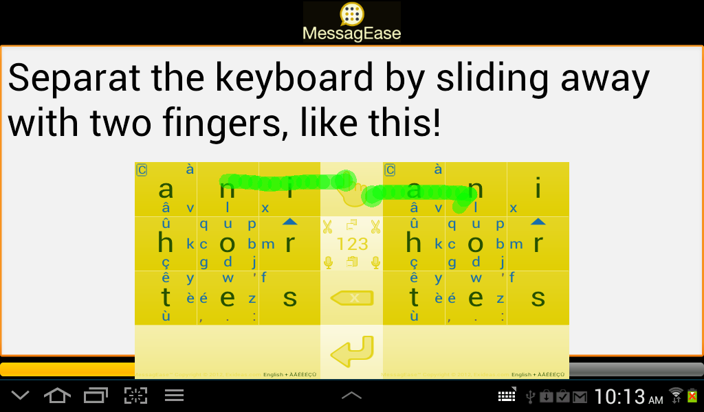
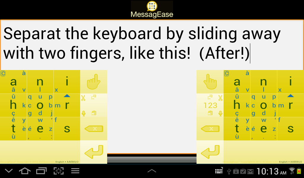
For the wide keyboard sides to work as two independent letter keyboards, you must enable multi-touch first (Settings > Advanced Options). One you set that, then a legend (ABC/123) appears on that otherwise empty button. Once this is set up, you can also use two fingers to drag away from the hand, thereby separating the two parts. Like this:

FluxBB bbcode test

They become like this:

FluxBB bbcode test

And of course, you can resize the keyboard to fit your need.


About changing the geometry and matrix size: honestly it requires a lot of work and we are quite small, very resource limited. It is quire impractical to dedicate our resources to take this one when the number of people using it are going to be quite small.

Best,

Saied

Offline
  • 0
  • Reputation: 214
  • From: Viken, Norway
  • Registered: 13-Dec-2006
  • Posts: 5,361

OK, thanks. I missed the multi-touch setting. It was a bit of a challenge to separate the parts of the dual layout, as the Hand button was too small for two fingers! I had to resize the pads quite a bit before it worked. :)

I realize that it'd be hard to implement matrix geometry options. If you'll let me change the letters (including the main ones) I'll probably be very happy with that. Your keyboard is probably the best I've tried when it comes to implementation, as mentioned!

Last edited by DreymaR (03-Dec-2012 09:40:56)

*** Learn Colemak in 2–5 steps with Tarmak! ***
*** Check out my Big Bag of Keyboard Tricks for Win/Linux/TMK... ***

Offline
  • 0
  • Reputation: 23
  • From: Belgium
  • Registered: 26-Feb-2008
  • Posts: 482
Saied said:

It would be nice to have a full reconfiguration capability, but our success depends on, even requires, a degree of uniformity across devices, not only across your devices. We hope and dream that you would be able to use MessagEase across many platforms, some of which you may not own. For that reason, we think we should keep the main layout intact.

Some people, like DreymaR, will want to (nearly) fully customize the complete layout, but others may merely want to swap a few letters to better fit their native language, like some of the localizations you already include.  For example I would like to swap H with either D or L to accommodate Dutch/Flemish.  Accidentally, you offer both of these combinations already (as Spanish and Italian, respectively), but it won't be scalable for you to research & implement localizations for all languages and alphabets.  Therefor I also think it would be worth making it fully customizable, but perhaps hide it under advanced options?

For the size of the keyboard though, I am convinced 3x3 is really the best size – at least for smartphones.  I tried similar keyboards with more keys, but quickly found the keys too small.  With ME it is impossible to mistype a key.

DreymaR said:

OK, thanks. I missed the multi-touch setting. It was a bit of a challenge to separate the parts of the dual layout, as the Hand button was too small for two fingers! I had to resize the pads quite a bit before it worked. :)

You can also just drag left with one hand, hold it, and then drag right with the other. :-)

Offline
  • 0
  • Reputation: 214
  • From: Viken, Norway
  • Registered: 13-Dec-2006
  • Posts: 5,361

Haha, so you can so you can. Thanks ghen!

As an afterthought: Padding the 3×3 matrix with special keys on both sides would remove the somewhat problematic out-of-edge swipes to the sides, but the bottom row would become problematic instead. Seems there's no very easy answer to this one, except:

Could you add an option to make the space bar row narrower – ideally with a slider? That wouldn't mess with the geometry per se, but it would give us the possibility of reclaiming half a row's worth or so of screen! And in my opinion it'd look good too. Some really hardcore users might be happy using the 3×3 block corner swipes for Del and Space, even (although I don't see myself being happy with that alone)!

Last edited by DreymaR (03-Dec-2012 10:50:42)

*** Learn Colemak in 2–5 steps with Tarmak! ***
*** Check out my Big Bag of Keyboard Tricks for Win/Linux/TMK... ***

Offline
  • 0
  • Reputation: 23
  • From: Belgium
  • Registered: 26-Feb-2008
  • Posts: 482
DreymaR said:

Some really hardcore users might be happy using the 3×3 block corner swipes for Del and Space, even (although I don't see myself being happy with that alone)!

It's already there. :-)  I+upright = enter, S+downright = space, T+downleft = backspace.  (see "inhibit CR in blank" under advanced options, yeah, not the best place to document this...)

So technically yes you could get rid of one row.  But like you said offscreen swipes are harder.  Btw, you can actually swipe down-then-right instead of straight diagonally, this can be easier depending on the position.

Offline
  • 0
  • Reputation: 0
  • Registered: 02-Dec-2012
  • Posts: 4

Thank you for your thoughts.

I put these on our list. We'll get to them when our resources enable us to do so.

Our upcoming customization feature should obviate the need additional reconfiguration though.

Best,

Saied

Offline
  • 0
  • Reputation: 0
  • Registered: 01-Nov-2012
  • Posts: 34

Thats a nifty program.  I do not have a smart phone, but if I did, I would be tempted to try it out (and even more tempted to move letters around).

I do think you could benefit by a utilizing a more advanced digraph frequency analysis. 

For example: Although H is a common letter, 54% of the time it is preceded by a T (ignoring when H is the first letter), and 42% of the time its followed by an E (ignoring when H is the last letter).

Without trying to hard, this is a possible alternative:
A I L
N O R
T E S

T>E = H
N>T=D
O>N=M
E>O=C
O>E=V
O>R=U
N>O=G
etc...

Offline
  • 0
  • Reputation: 23
  • From: Belgium
  • Registered: 26-Feb-2008
  • Posts: 482
Loonster said:

For example: Although H is a common letter, 54% of the time it is preceded by a T (ignoring when H is the first letter), and 42% of the time its followed by an E (ignoring when H is the last letter).

Based on my limited experience (4 days now, but already 30 wpm), I don't think you can speed up digrams the way you propose; tapping is really much quicker than dragging.  Your proposed "T + drag T->E + E" sequence for "the" would certainly be slower than the current tap-tap-tap.  The game statistics indicate "the" is my fastest word.

That being said, I also don't "feel" the letter placement is optimal yet.  I can't back it by numbers, but I think for a lot of frequent letter combinations, my finger is hovering all over the keyboard more often than it should.  But, on the other hand, the distance is short and it's hard to fat-finger the big buttons.  So the difference between having T, H and E buttons aligned next to each other vs. the current layout, would hardly be measurable.

My most common mistakes are swiping in the wrong direction, eg. swapping U and L.  That, and looking for those less frequent letters, are currently my biggest slowdowns.

So I think by far the biggest factor for speed is putting the 9 most frequent letters on the main (tap) positions, and next, arranging the others in "logical" positions so you can easily remember them.  But the second factor will be reduced by practice and eventually, muscle memory

Offline
  • 0
  • Reputation: 214
  • From: Viken, Norway
  • Registered: 13-Dec-2006
  • Posts: 5,361

Here's how I envision an easy-to-remember-yet-optimised Colemak-MessagEase pad now:
• Generally top-row outwards, bottom-row inwards (but the gDb column has to be fit in somehow).
• Punctuation is placed partly using the columns as mnemonics (ARSTD → !@#$%), partly as in standard MessagEase.
• Like in standard MessagEase, the up/down swipes on the left column are reserved for locale characters like ÆØÅŒé...
• I think the standard MessagEase parentheses are hard to use (off-edge swipes) so I gave them a better position.
• Note that 4 of the 9 main keys (AHOE) are in the same place for Colemak-MessagEase and the classic ANI/HOR/TES!

+-----+-----+-----+
|•    |` ^ ´|  • •|     A→UL: Combine (for the ~`^´¨ accents); S→UR: Enter
|• A !|? R @|# S •|     A→L/S→R: ←/→ navigation
|~   z|/ x \|c ° ¨|
+-----+-----+-----+
|{   =|q w f|$ • }|
|[ H k|j O p|v T ]|     T→U/D: Shift on/off
|<   _|l u y|b • >|
+-----+-----+-----+
|&   m|" g '|d % €|
|| N (|) E ;|: I →|     S→U/I→D: ↑/↓ navigation
|•   -|+ * ,|. • •|     N→DL: Backspace; I→DR: Space
+-----+-----+-----+

Yeah, that looks sweet. I can't help but wonder what Saied will think of it. ;)

Last edited by DreymaR (04-Dec-2012 15:19:11)

*** Learn Colemak in 2–5 steps with Tarmak! ***
*** Check out my Big Bag of Keyboard Tricks for Win/Linux/TMK... ***

Offline
  • 0
  • Reputation: 23
  • From: Belgium
  • Registered: 26-Feb-2008
  • Posts: 482

The "HOT" keyboard. :-)

But why did you move the punctuation characters?  I think they should stay close to the space bar, which they ~always precede.

Offline
  • 0
  • Reputation: 214
  • From: Viken, Norway
  • Registered: 13-Dec-2006
  • Posts: 5,361

HOT indeed! ;)

You're right, I didn't think of that. Better now, with the semicolon "shifted" up? Heh, that's like on the locale keyboards too: Semi-/colon in shifted positions over dot/comma.

Last edited by DreymaR (04-Dec-2012 10:33:34)

*** Learn Colemak in 2–5 steps with Tarmak! ***
*** Check out my Big Bag of Keyboard Tricks for Win/Linux/TMK... ***

Offline
  • 0
  • Reputation: 23
  • From: Belgium
  • Registered: 26-Feb-2008
  • Posts: 482

No, "shifted" in this context would mean drag+return. ;-)  But I'd keep the frequent punctuation characters on "first order" drags, and again, closer to the space.  I think they are fine on the existing ME layout.

But, of course, all this is subordinate to the letter layout.  I like your Colemak'esque main letter layout (ARSHOTNEI) at first sight, but I think having the secondary letters in "familiar" positions has much less value, and looks rather arbitrary.  The value of their positions on a full size Colemak keyboard (wrt. digraphs, rolls, etc) doesn't carry over here.

Offline
  • 0
  • Reputation: 214
  • From: Viken, Norway
  • Registered: 13-Dec-2006
  • Posts: 5,361

It feels to me as if they'll be easier to remember this way at least. Time will show?

Of course a digraph isn't the same here. Using these mappings will ensure a low number of same-key digraphs (tap-drag combos) but those may not be so problematic. When dual-thumb typing I think same-key has a slight disadvantage but not as much as same-finger on a full keyboard.

Last edited by DreymaR (04-Dec-2012 11:43:51)

*** Learn Colemak in 2–5 steps with Tarmak! ***
*** Check out my Big Bag of Keyboard Tricks for Win/Linux/TMK... ***

Offline
  • 0
  • Reputation: 214
  • From: Viken, Norway
  • Registered: 13-Dec-2006
  • Posts: 5,361

Hmmm... Come to think of it, the idea would be to have a feel for where keys are. Left-hand (ARST) should be generally up/left, then? Now it's up/right which seems a bit counterintuitive to me.

| R | S | T |
| A | O | I |
| H | N | E |

...would keep the ARST to the left and HNEIO together. Also, the inner upper row would be 'wfp', better than 'qwf' since it brings the 'f' to the middle. Maybe 'jlu' is better than 'luy' too - shouldn't be worse at least.

Looks more different from the standard MessagEase pad then. Well, so be it I guess. I don't like breaking the NEI bottom row though! Keeping E in the middle should be better for two-thumb and especially left-thumb typing.

Last edited by DreymaR (26-Dec-2012 20:31:23)

*** Learn Colemak in 2–5 steps with Tarmak! ***
*** Check out my Big Bag of Keyboard Tricks for Win/Linux/TMK... ***

Offline
  • 0
  • Reputation: 214
  • From: Viken, Norway
  • Registered: 13-Dec-2006
  • Posts: 5,361

I've been having fun with the remap functionality in the new version of MessagEase (v8.0.2 for Android)!

   MessagEase_Std-vs-ColemakoidNor_sm.png
   The standard MessagEase layout (with most symbols active) to the left,
   and my "Colemakoid" version with mnemonic mappings to the right (with ÆØÅ and Ç special letters on the left-hand column).

The ANI HOR TES tap letters aren't remappable to ARS TOH NEI or whatever I'd like to use (see posts above) but that's no deal-breaker: The tap letters are very quickly learnt and I'm sure ANIHORTES is a first-year spell on Hogwarts. ;)

I tried out different systems, and ended up with the QWFPG/ZXCVB left-hand top/bottom rows on the 41236 keys as shown, upper row pointing up visually on 123 at least. The right-hand  JLUY/KM fit in on the 789 keys and I found it most intuitive to stick with the upper row above there too. Fortunately, this puts common letters like DL in decent positions (and CUMWFGYP in okay positions) I think. The one extra letter in this setup is the not too common G (2.0%) which works well on a diagonal drag from R so the more important D (4.3%) can have the center drag. Most of the drags work well enough anyway, so I don't think it's worth fretting over the relative frequencies of the rare letters at any rate.

Symbols are placed by their number keys, so !@#$%&* are on the 1234578 keys as expected (except that the 5 key is full so the % sign goes next to it). The ^ isn't on 6 because the 6/R key is busy and all the accents are gathered at the top. The -+=_ symbols are placed around the 9 key as on a normal keyboard.

On the 123 pad, I placed fractions/superscripts/†‡ more consistently, put square root on the 2 (for square) key, ∞ on 8 and integral on the same key as + (9) because that made sense to me. Pilcrow has roughly the same shape as 1 (not that I ever type ¶ in an SMS, heh...).

I'd like to have the drag-arrow keys back because I'm not good at using the Space bar to navigate back and forth (I keep inserting spaces when I try to navigate multiple times in a row). It would've been cool to be able to remap to those! (Saied: Yes, I know you guys are busy. No sweat!) Maybe I'll get used to it eventually.

We can't yet remap the drag-return mappings so when I move the !? their ¡¿ drag-return counterparts are still in their original place (between 2 and 3). Too bad - unless you prefer to use the Compose key for those anyway. In the future I think we'll either be able to remap those as well or they'll follow their drag-release counterparts automatically. At present, the drag-return mappings aren't even properly documented so they're a bit work-in-progress (but nice for us glyph freaks!).

Ghen is probably already too expert with the standard MessagEase setup to benefit from this or want to use it (congrats on breaking the 50 WPM speed barrier btw!). But for me it feels a lot more intuitive and hence easy to learn. What do you guys think though?

Last edited by DreymaR (30-Dec-2012 08:08:31)

*** Learn Colemak in 2–5 steps with Tarmak! ***
*** Check out my Big Bag of Keyboard Tricks for Win/Linux/TMK... ***

Offline
  • 0
  • Reputation: 23
  • From: Belgium
  • Registered: 26-Feb-2008
  • Posts: 482

Interesting work DreymaR!  I agree that the benefit would mainly be ease to remember (and perceived elegance), not additional speed.  So yeah, I'll stick to what I know by now. :-)  (neither do I have the need to add special characters for my language)

As for the drag+return mappings, I'm sure you'll get those, too.   Make sure to send your feedback!  I'd like to see things like NBSP on eg. circle on space, but surely that will end up as a low prio request. :-)

Offline
  • 0
  • Reputation: 214
  • From: Viken, Norway
  • Registered: 13-Dec-2006
  • Posts: 5,361

Perceived elegance could be important for acceptance! It's certainly helped Colemak versus the overdone Dvorak and chaotic Arensito for instance.

I just hope that it won't be any slower in any way. I shouldn't think so but it's hard to tell, really.

Last edited by DreymaR (27-Dec-2012 12:08:16)

*** Learn Colemak in 2–5 steps with Tarmak! ***
*** Check out my Big Bag of Keyboard Tricks for Win/Linux/TMK... ***

Offline
  • 0
  • Reputation: 214
  • From: Viken, Norway
  • Registered: 13-Dec-2006
  • Posts: 5,361

I have a question about the main ANIHORTES layout (for Ghen, or Saied if he sees it):

Why is the TH bigram which is the most common one in English (at 1.5 %), placed so it's hard to type with alternating thumbs? Since MessageEase aims to be supremely fast (as ChengWei and others have proved it to be) then two-thumbs typing is where it's at, and this seems like a big problem to me? The next most common bigrams according to Wikipedia are HE IN ER AN RE ND AT ON (at 0.6 %), and only the last one of these may be typed on the middle column. I may be missing something; I'd love to know what.

The most common trigrams are THE, AND and THA, and none of these are easy either.

Again, I think this may illustrate how nice it'd be if you did manage to make the main letters too remappable. (Yes, I know, you don't have the resources for it now...)

Edit: In light of the above, I'd like the middle column to contain the THE trigram! It'd also point down towards the Space to produce the word 'the ' with speed and elegance. The other columns could be arranged in any way I believe, but I myself would like a Colemak-inspired setup:

| A | T | N |
| R | H | I |
| S | E | O |

ARSTHENIO - sounds like a wise nobleman in a Shakespeare play! :)

It's not only the dual-thumb thing: Keeping two of the three most common letters in English (as well as the two most common bigrams and the most common trigram) on the middle column should make the layout good both for left- and right-handers?! My suggestion should also balance the load of the left and right columns, as the left column contains the third common letter ('a') and the right column the next ones ('oin').

Are there any compelling reasons to keep O in the middle of the layout? It looks good there, being round, but other than that? It doesn't show up much in the common digrams.

Last edited by DreymaR (03-Jan-2013 13:02:51)

*** Learn Colemak in 2–5 steps with Tarmak! ***
*** Check out my Big Bag of Keyboard Tricks for Win/Linux/TMK... ***

Offline
  • 0
  • Reputation: 23
  • From: Belgium
  • Registered: 26-Feb-2008
  • Posts: 482

According to the white paper the layout has been designed to minimize finger travel when using one finger.

And that's how I use it, holding my phone with one hand and typing with the other (and I've achieved 54 wpm so far).

I think the best way to use two hands is the split mode (with multi touch enabled), but personally I prefer the portrait orientation.

Offline
  • 0
  • Reputation: 214
  • From: Viken, Norway
  • Registered: 13-Dec-2006
  • Posts: 5,361

You're doing 54 WPM with one thumb? Wow. But in the speed record at least, ChengWei uses both thumbs. I'm only half as fast as you (yet), but I don't think I could do even that speed with only one thumb. Furthermore, it sounds uncomfortable?

Maybe you should try to beat ChengWei soon? ;)

Last edited by DreymaR (30-Dec-2012 23:44:11)

*** Learn Colemak in 2–5 steps with Tarmak! ***
*** Check out my Big Bag of Keyboard Tricks for Win/Linux/TMK... ***

Offline
  • 0
  • Reputation: 0
  • From: Ohio, U.S.
  • Registered: 09-Dec-2012
  • Posts: 101

Is there any way to set MessagEase up as Android's keyboard for the password-unlock screen?  I currently have an unlock pattern set up because entering anything with the default on-screen keyboard is a chore, but this keyboard looks like it might just change that.  The pattern is nice because I can enter it without looking at the screen, but I'd consider switching to a password for slightly better security if I could use a halfway-decent keyboard to enter it with minimal trouble.

Offline
  • 0
  • Reputation: 23
  • From: Belgium
  • Registered: 26-Feb-2008
  • Posts: 482

DreymaR: no, I'm using my index finger.  The left one, as I'm left handed, holding the phone in my right hand.

UltraZelda64: it uses the default input method for that (which you can set to be any keyboard).  At least that's how it works on my phone, with Android 4.1 and TouchWiz.  Use the blind ME keyboard for extra obscurity points. ;-)

Last edited by ghen (31-Dec-2012 08:12:26)
Offline
  • 0
  • Reputation: 0
  • From: Ohio, U.S.
  • Registered: 09-Dec-2012
  • Posts: 101
ghen said:

UltraZelda64: it uses the default input method for that (which you can set to be any keyboard).  At least that's how it works on my phone, with Android 4.1 and TouchWiz.  Use the blind ME keyboard for extra obscurity points. ;-)

Hmm... my phone came with Swype installed and set as the default keyboard, and even after setting MessagEase as default my password unlock screen looks like it still uses the crap Android basic on-screen keyboard.  Android 2.2.2, LG Optimus V... maybe older versions did not allow this.  Good idea on the hidden keys... haven't thought of that.

Offline
  • 0
  • Reputation: 214
  • From: Viken, Norway
  • Registered: 13-Dec-2006
  • Posts: 5,361

I edited my bigram post above with some new thoughts. Could ARSTHENIO (columnwise) be better than the default AHTNOEIRS? Or would it lead to something unforeseen, such as long finger travel?

Last edited by DreymaR (03-Jan-2013 13:08:16)

*** Learn Colemak in 2–5 steps with Tarmak! ***
*** Check out my Big Bag of Keyboard Tricks for Win/Linux/TMK... ***

Offline
  • 0