• You are not logged in.

    The history of QWERTY revisited

    • Started by DreymaR
    • 4 Replies:
    • Reputation: 214
    • From: Viken, Norway
    • Registered: 13-Dec-2006
    • Posts: 5,362

    We've been over the claims found everywhere including our very own Colemak front page, that QWERTY was constructed to prevent the jamming of the early mechanical typewriters' bars (thus forcing common bigrams apart as witnessed by TH and HE etc – but not ER which on the other hand was changed between versions of Sholes' layouts) and also so that salesmen could easily produce the word TYPEWRITER.

    These claims have been bandied about, scrutinized and don't seem to stand too strongly anymore. For one, the jamming models would've been outdated in 1878 when Sholes patented the Sholes-Glidden layout that Remington put into production with their new models – certainly when it was made the de facto layout standard in 1893 by agreement between the biggest typewriter manufacturers. And the salesmen thing doesn't seem substantiated – it could very well be just an urban myth in the "it's so good it has to be true" genre.

    I just found a quite interesting read about QWERTY history based on some more recent studies. Japanese researchers, apparently, have investigated how the QWERTY really came to be over several years of testing by morse code transcribers. These would need letters that have the same beginning in morse code to be close on the keyboard so that they could start hovering when they heard the beginning and then fall down on the right letter(s) quickly. Also, to keep up with the telegraph they couldn't afford the layout to be made for slowing you down obviously! That'd be just silly.

    Now I don't claim that this is the (only) right answer, but as I said it's a good read for a keyboard freak. Also note the improved Sholes layouts that didn't make it once Remington had theirs in place – the one shown below seems more like the later optimized layouts (it's from 1889, 11 years after the QWERTY was patented). It reduces bottom row usage, bunches the vowels much like the Dvorak layout does and puts less common letters in the hard-to-reach spots. It'd be fun if anyone were to run that one through a modern metrics analysis! :)
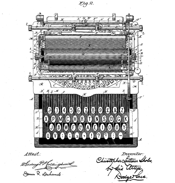
    sholes-patent-1889.jpg

    I just *love* that image! And the signatures, so stylish and fin-de-siècle...

    Last edited by DreymaR (09-May-2013 19:38:03)

    *** Learn Colemak in 2–5 steps with Tarmak! ***
    *** Check out my Big Bag of Keyboard Tricks for Win/Linux/TMK... ***

    Offline
    • 0
    • Reputation: 0
    • Registered: 04-Apr-2013
    • Posts: 538

    The improved sholes layout doesn't seem home-row friendly at all.  The more used-letters on the upper-right should probably be swapped with the lesser-used ones in the home-left, as a first-order improvement.

    As for the history, I can't pretend to know or care very much, but I'm skeptical of Yasuoka's main thesis against jamming.  I skimmed (tried to read, couldn't really) their paper; it read more as a list of claims, sprinkled with some side irrelevancies, than a serious evidential analysis.

    I find Christopher Keep's comment the most sensible.


    In fact, if you look at the layout originally presented to Remington, the notion that it was designed to avoid digrams starts to look even more plausible:

    2 3 4 5 6 7 8 9 - ,
    Q W E . T Y I U O P
    Z S D F G H J K L M
    A X & C V B N ? ; R

    whereas the final QWERTY layout is presumably to improve on some other factors.


    DreymaR said:

    For one, the jamming models would've been outdated in 1878 when Sholes patented the Sholes-Glidden layout that Remington put into production with their new models

    The patent was applied for in 1875, however. 1878 is only when it was granted.

    As for the 1893 standardization, of course they were going to standardize on what was selling well at the time.

    Last edited by lalop (09-May-2013 19:41:58)
    Offline
    • 0
    • Reputation: 214
    • From: Viken, Norway
    • Registered: 13-Dec-2006
    • Posts: 5,362

    Good points. I don't buy the telegraphist story as a full explanation or as proof, but found it interesting at least. I agree that Keep's comment seems a sensible one. :)

    As for home row friendliness, touch typing as we know it hadn't been invented yet unless I'm mistaken so one shouldn't expect overmuch. Nevertheless, these days my feeling is that the Colemak WF and UY keys are practically home row positions too – how's it looking with that in mind?

    One eyesore with the improved Sholes layout is how ET/TE, EA/AE and AT/TA all seem to become same-finger bigrams! Unless he had some other fingering in mind, that is not a modern touch typist's dream at all. In fact, a bigram analysis supposing modern fingering looks rather disastrous...

    Last edited by DreymaR (09-May-2013 19:44:09)

    *** Learn Colemak in 2–5 steps with Tarmak! ***
    *** Check out my Big Bag of Keyboard Tricks for Win/Linux/TMK... ***

    Offline
    • 0
    • Reputation: 0
    • Registered: 04-Apr-2013
    • Posts: 538

    In another comment, someone questioned whether "QWERTY being designed to slow typists down" is actually a myth.

    That's interesting.  Why do we think it's a myth?  It may seem irrational at first glance, but decreased speed would've also helped to reduce the number of typing jams.  Since Remington provided training courses (as stated in the article), it might also have made sense for them not to design a particularly easy layout.  Finally, we know from the blog that the assertion was serious enough to be included in a 1977 paper.

    The point of the present missive is not to defend the accuracy or otherwise of Ms Malt's statement, but merely highlight its existence, to point out that since 1977, there has been a solid piece of evidence, a refereed academic paper, presented to an organisation created specifically to research this field, and thus would prima facie, be considered credible experts. If Ms Malt had said something which was incorrect, these would be the people to nail her hide to the wall.

    How did the claim go from that to the status of myth?

    Last edited by lalop (22-Jul-2013 11:17:09)
    Offline
    • 0
    • Reputation: 7
    • Registered: 21-Apr-2010
    • Posts: 818

    When you look at Qwerty it appears as though it started off alphabetised.  There are remnants of such on the home row.  In practice, I guess, it didn't work as a viable layout.  However it may have been an easier to learn letter placement.  Which does beg the question: Why and how did Sholes and co arrive at their final layout?

    I thought a main impedement to some typewriter layouts was the hammer collisions.  This happens anyway, but I guess it could have been legions worse under some layouts.

    Dvorak also designed a typewriter layout, but years later.  The vowel separation on the left hand that lends itself to hand alteration partly remedies the hammer collision issues.  Which raises the question as to why Sholes didn't bother doing the same?  Unless the Y, U, I and O placments were an attempt, or a natural evolution towards something similar.

    I just checked 'The Iron Whim' by Darren Wershler-Henry, and it's chapter 'Qwerty', actually points out that it's hypothesised that the keyboard started out alphabetised,  but there is lack of evidence of such, apart from the middle row clue.  And that to avoid hammer (type bars) collides, Scholes took a list of common digraphs and tried to place each letter of each, on opposing sides of the keyboard.

    Again there's no mention of trying to slow the typist down, but the exact culmination in the layout is left to the imagination, as there is scant fact.

    An interesting point the book mentions is that the hardest keys to press are backspace and shift-lock.  Was there a need for a backspace?  Perhaps the right hand got a bit of a break with the keys, as it had other work to do: carriage returns, sweeps and paper changes.

    I personally can't see any benefit in slowing the typist down (except to lesson the key jams - or RSI!).  I wouldn't dismiss mudslinging in an effort to finanancially benefit from the dethroning of Qwerty.  You would hope that the origins of such statements should be easy verify - with the digitisation of everything...

    Re-reading Dreymar's post, I see that Scholes did have a go at bettering his layout.  Very interesting!  I guess Dvorak must have been in-part inspired by that work.  How much was the layout inspired by machine?

    "The keyboard is a crazy patchwork put together too long ago in a series of heartbreaking experiments to fit keys into positions without their colliding or sticking, and so to invent a usable machine.  It was put together a few fingers at a time when no one dreamed of fast, all finger, touch typing" - August Dvorak.

    Last edited by pinkyache (23-Jul-2013 11:05:13)

    --
    Physicians deafen our ears with the Honorificabilitudinitatibus of their heavenly Panacaea, their sovereign Guiacum.

    Offline
    • 0