• You are not logged in.

Colemak vs. Qwerty Frequency Diagrams

  • Started by Checkit
  • 55 Replies:
  • Reputation: 0
  • Registered: 12-Nov-2006
  • Posts: 13

Hello all,

Today I decided to see if I could produce some sort of visual representation to show the difference between Colemak and Qwerty. I took the image of the Colemak layout from the Colemak homepage and brought it into Photoshop in order to make frequency diagrams for both Colemak and Qwerty.

Here are the results (click for larger image):
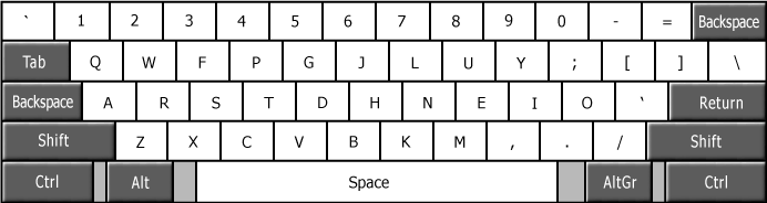
Colemak
colemakfrequencylw1.th.png

Qwerty
qwertyfrequencyqt1.th.png

As you can see from the diagrams, the majority of the keystrokes for Colemak are clustered around the home row, whereas the keystrokes in Qwerty are more or less randomly positioned throughout the keyboard.  The diagram also shows Qwerty's strong left hand bias.

==Methodology==
I took the following letter frequencies from the Wikipedia entry:

e     12.702%
t     9.056%
a     8.167%
o     7.507%
i     6.966%
n     6.749%
s     6.327%
h     6.094%
r     5.987%
d     4.253%
l     4.025%
c     2.782%
u     2.758%
m     2.406%
w     2.360%
f     2.228%
g     2.015%
y     1.974%
p     1.929%
b     1.492%
v     0.978%
k     0.772%
j     0.153%
x     0.150%
q     0.095%
z     0.074%

I took the frequency for the most frequently occurring letter (e - 12.702%), divided all the other frequencies by that number, and multiplied by 100, in order to get a number from 1 to 100 that represented the relative frequency of each letter.  Those relative frequencies are:

e     100
t     71
a     64
o     59
i     54
n     53
s     49
h     47
r     47
d     33
l     31
c     21
u     21
m     18
w     18
f     17
g     15
y     15
p     15
b     11
v     7
k     6
j     1
x     1
q     0
z     0

The Greyscale slider is a tool in Photoshop that represents colour on a continuum from 1 to 100, with 1 being pure white and 100 being pure black.  I then used the Paintbucket tool in Photoshop to fill in each key on the diagram, setting the Greyscale slider value to the calculated relative frequency number of the letter.  The result is that each key is darkened according to its relative frequency in the English language.

I was hoping that these diagrams might help people to visualize just how much of a difference exists between Colemak and Qwerty.

Comments?

Last edited by Checkit (02-Mar-2007 04:07:03)
Offline
  • 0
  • Reputation: 0
  • From: NYC
  • Registered: 02-Feb-2007
  • Posts: 104

great diagrams that prove the stats..making it more visually comprehensible.

Offline
  • 0
  • Reputation: 0
  • Registered: 20-Oct-2006
  • Posts: 111

Very nice.

Offline
  • 0
  • Reputation: 0
  • Registered: 12-Nov-2006
  • Posts: 13

Update: I decided to create a diagram for the Dvorak layout as well.

Dvorak
dvorakfrequencycn3.th.png

I think it illustrates some of the known problems with the Dvorak layout, such as the placements of UI and RL, as well as the right hand bias.

Last edited by Checkit (02-Mar-2007 04:08:12)
Offline
  • 0
  • Reputation: 0
  • Registered: 20-Oct-2006
  • Posts: 111

Dvorak looks distinctly clunky when presented like that.  Not QWERTY clunky, but still not so great.

Offline
  • 0
  • Reputation: 210
  • From: Viken, Norway
  • Registered: 13-Dec-2006
  • Posts: 5,343

Cool! A few suggestions if you want them:
- Remove the bottom row (and possibly the Shift/Tab/Enter stuff); they're messing up the impression.
- If you manage to, use a colour lookup table like HotMetal. That'd show the "hotspots" even better.

[edit: Inspired by your images, I followed my own suggestions and made HotMetal and BlackBody images from yours. Not entirely sure what to make of them, but I'll post them later and let you decide yourself.]

Last edited by DreymaR (03-Mar-2007 17:38:16)

*** Learn Colemak in 2–5 steps with Tarmak! ***
*** Check out my Big Bag of Keyboard Tricks for Win/Linux/TMK... ***

Offline
  • 0
  • Reputation: 0
  • Registered: 12-Nov-2006
  • Posts: 13

Thanks for the suggestions DreymaR.  I would definitely like to see your modified images.

Offline
  • 0
  • Reputation: 210
  • From: Viken, Norway
  • Registered: 13-Dec-2006
  • Posts: 5,343

Okay, I finally got around to uploading them:

Grayscale:
KeyFreqs_Checkit_Grays.gif

Blackbody (Photoshop's scale):
KeyFreqs_Checkit_Blackbody.gif

Hope someone like those. At any rate, I had my fun making them so I'm not complaining.

One question: Would it be an idea to change the "e" color from completely white/black to something just a little more moderate? It is the single most important key for sure, but with the current scaling it stands out like a sore middle finger (hehe). It'd only be a case of changing the image brightness/contrast really - a natural thing to do while viewing an image to bring out the interesting parts. (We do it in medical imaging, except there it's called Window/Level instead - same thing though.)

[Edit 2: I recompiled your pictures, but didn't change anything important. I'll post my own versions below. I also took out a few long-winded phrases from this post.]

Last edited by DreymaR (13-Mar-2007 09:01:40)

*** Learn Colemak in 2–5 steps with Tarmak! ***
*** Check out my Big Bag of Keyboard Tricks for Win/Linux/TMK... ***

Offline
  • 0
  • Reputation: 0
  • Registered: 12-Nov-2006
  • Posts: 13
DreymaR said:

One question: Would it be an idea to change the "e" color from completely white/black to something just a little more moderate? It is the single most important key for sure, but with the current scaling it stands out like a sore middle finger (hehe) and also makes the image tweaking difficult. You scaled it so that the "e" frequency corresponds do 100% but it should probably be less for a better visual impression: I suggest multiplying all percentages by 7 so that the "e" value ends up at around 90%. Also, adding a value offset of, say, 5 to all keys would make the least used keys stand out just a little from the background (or black) color which would also be a good idea if you ask me - even if it has no base in reality as such. It's more about the visual impression than about the "reality" of the pixel values when push comes to shove. A scale from roughly 5% to 95% sounds good to me, avoiding the visual extremes in both ends - the (percentage*7 + 5) formula accomplishes this.

Yes, the fact that the "e" is so overwhelmingly dark forces a lot of the remaining keys to be very light, and therefore makes the differences between all the "non-e" keys less noticeable.

For me, the fun part was thinking up the idea and making the original images in order to see how it would turn out.  I don't know how interested I would be in further optimizing these images.

If I work on them again I will play around with your suggestions.

Offline
  • 0
  • Reputation: 0
  • Registered: 12-Nov-2006
  • Posts: 13

P.S. What is HotMetal and BlackBody?

Offline
  • 0
  • Reputation: 210
  • From: Viken, Norway
  • Registered: 13-Dec-2006
  • Posts: 5,343

Hello again - it's touchdown time! I've done a lot - entirely too much, believe me! - of further research and pondering, and made my own favourite versions of your great idea.

Hotmetal and Blackbody are color profiles or "lookup tables" that remap grayscale values to something else. We use them in medical imaging. For looking at anatomy, the doctors want grayscale images, but artificial coloring has the benefit of making "hot" and "cool" spots stand out better so this is used for many functional (processed) image types. The Hotmetal one has a blue ("cool") to red ("hot") scale, and the Blackbody emulates a glowing object from dark red to yellow and white "hot". After a few tryouts, I settled for the Blackbody table in Photoshop as the most visually instructive palette. I used a percentage-to-graylevel(-to-blackbody) conversion like you, but inverted the scale so frequent keys are bright instead of dark.

I adjusted the brightness/contrast as discussed before (0-100% frequency mapped to 5-115% brightness; the E falls back to 100%). The main effect is to bring out the range that really matters: The differences between the common and the rare keys. I was quite pleased with the net effect: Yellows lighting up the common positions, bright reds for the intermediate and dark reds showing the rare ones.

KeyFreqs_WikiEng_blackbody.gif

I find it very instructive how the Colemak gets all the hot spots under your home positions, with the bright reds also on the strong fingers. In contrast, QWERTY is a bloody shambles as expected, and the troubles with Dvorak's U vs. I and R+L stand out rather clearly. (Too bad you can't see the LS digraph, hehe.)

See also the readme file for these images:
https://dl.dropboxusercontent.com/u/145 … _notes.txt
If you're really interested, here's the full story including grayscale images and my Excel workbook full of calculations and research:
https://dl.dropboxusercontent.com/u/145 … encies.zip

All sources are linked to in that Excel book. In case Shai or other people take an interest: I, Øystein Bech Gadmar, release the files I link to in this thread to the Public Domain. Do with them as you please. The research behind them should be credited/referenced as in my Excel file, in particular:
– The Wikipedia letter frequency article:
https://en.wikipedia.org/wiki/Letter_frequencies
– David "qwertie" Piepgrass' research, particularly the punctuation frequencies:
http://millikeys.sourceforge.net/freqanalysis.html
– CodePad's list of frequencies in 4 different languages (for which I haven't found the original source unfortunately):
http://codepad.clanhosts.com/index.php?art=frq
– KryssTal's list of language use (a nice and interesting site btw!):
http://www.krysstal.com/spoken.html

Next on the DreyGeek channel: Comparative statistical linguistics!  :)

Last edited by DreymaR (10-Jul-2014 10:37:45)

*** Learn Colemak in 2–5 steps with Tarmak! ***
*** Check out my Big Bag of Keyboard Tricks for Win/Linux/TMK... ***

Offline
  • 0
  • Reputation: 210
  • From: Viken, Norway
  • Registered: 13-Dec-2006
  • Posts: 5,343

Ah, now for the fun bit. Look at this one:

KeyFreqs_Intl+E_blackbody.gif

This image shows a weighted average of key frequencies in the 4 biggest Western languages using Latin letters - English, Spanish, French and German. I used data from CodePad's page together with language usage data KryssTal and some other stuff (links above). There were some choices to be made:
– I added the Portuguese speakers to the Spanish ones. They'll resent me for that I'm sure, but I felt that the letter frequencies in those two languages probably are closer to each other than to other languages thus hopefully justifying my action.
– I had a hard time figuring out the figure  :)  of 510 M English "speakers" in the world. Another place on the same site it's stated that there are 300 M first-language, 300 M second-language and 100 M foreign-language users of English - but those numbers don't quite make sense to me. I mean, there must be what – 400+ M? – first-language English speakers living in the UK and US alone? My best guess then is that the (300+300+100) M figures are outdated and the 510 M figure represents a more current number of native English speakers.
– Therefore, for the image above (but not for the next one below!) I added a stipulated number of 500 M to the English-speaking figure, bringing it to 1010 M English "users" in total versus 643 M Spanish+Portuguese "users".

In the image below, I made a direct comparison of the Wikipedia numbers (top halves) with the weighted language figures (bottom halves) - this time not adding anything to the English usage (bottom halves) to make any differences all the more clear:

KeyFreqs_WikiEngOverIntl_blackbody.gif

The most interesting features are in my opinion:
– There's a big difference in usage for a few letters, mainly because of Spanish and French being more Latin languages than English and German. Most of these letters are rare however, and thus won't matter much to a keyboard layout. This effect is replicated in the images through the contrast setting and the visual similarity of dark red tones. The really striking one is H.
– Colemak solves the H issue elegantly by keeping it on its strong-finger stretch so it's neither too well nor too badly off. In contrast, Dvorak has a far too good H placement if you happen to write mainly Spanish or French! The right hand then gets in pretty much the same trouble with D vs. H as the left hand does with U vs. I.
– The rest of the picture is surprisingly calm.
– This bodes very well for keyboard layouts optimized for English but used by other American or West European users (disregarding some minor/-ity languages), as long as the H issue is addressed. Caramba!  :)

Everyone have different keyboard usage of course. I myself write maybe 70% English and 30% Norwegian these days. If you happen to use any combination of the 4 languages I studied here, you can fiddle with the usage numbers in my Excel book to make it represent your individual assessments of your own language balance. You just enter the percentages in the Usage row, deleting the real-world figures that are there now; use any scale you like as it's balanced by the sum automatically.

But it's also about what you type about. If you write about X-rays and X-boxes a lot, you'll use the X much for instance. Not easy to adjust for that unless you measure it yourself.

However, there is one interesting conclusion to draw with some certainty from this exercise I think: That the Colemak layout should work well for you (as far as single-letter statistics is concerned) no matter what combination of English/Spanish/French/German you happen to be using! Not 100% optimally maybe, but apparently really well. That's reassuring. (As a matter of fact, it looks to me as if both H and W are more optimally placed for the weighted language average than for English on the Colemak!)

Of course, there are many other important measures (digraph rolling, same-finger, hand alteration etc) and I haven't touched on those here. Piepgrass made a digraph table, but I haven't done anything with it nor do I have the energy to do so any time soon I think.

*phew* Man, that was fun.  :)

Last edited by DreymaR (10-Jul-2014 10:33:31)

*** Learn Colemak in 2–5 steps with Tarmak! ***
*** Check out my Big Bag of Keyboard Tricks for Win/Linux/TMK... ***

Offline
  • 0
  • Reputation: 0
  • From: Köln, Germany
  • Registered: 01-Apr-2007
  • Posts: 264

umm, Checkit, i might want to use the first three of your images on the german wikipedia article i'm making. Could you give me permission to use them and all of the relevant infos like lisence please? Thanks

Offline
  • 0
  • Reputation: 0
  • Registered: 05-Oct-2006
  • Posts: 105

WOW!
Very impressive!

I like the idea of the hot metal, because it'd look like a heat signature. The way it was implemented though, it's kind of difficult to figure out the progression/usage. Not nearly to see at a glance as the greyscale one.

I would suggest decreasing the spectrum of colors that you're using. You've got yellow, orange, red, white. I don't even know what the white or the black is suposed to represent. How about changing it to like yellow to orange to red.

Better yet. Make the infrequent ones a blueish color to represent cool/cold, and the more frequent ones progressively more red

Last edited by NeoMenlo (13-Apr-2007 23:32:16)
Offline
  • 0
  • Reputation: 210
  • From: Viken, Norway
  • Registered: 13-Dec-2006
  • Posts: 5,343

Thanks.

You have seen white hot metal, no? And metal that isn't even red hot will obviously be black. I find it quite intuitive. To get a quick-glance impression you just think heat and look quickly at it. I find that keeping the data in a large area of the standard hotmetal palette makes it more clear rather than less, but ymmv of course.

*** Learn Colemak in 2–5 steps with Tarmak! ***
*** Check out my Big Bag of Keyboard Tricks for Win/Linux/TMK... ***

Offline
  • 0
  • Reputation: 210
  • From: Viken, Norway
  • Registered: 13-Dec-2006
  • Posts: 5,343

Vilem, if you want to edit the German Wiki article then why not use my images instead? They take the German language into consideration.

Or we could make new images taking only English and German into consideration; for instance 50/50 usage as a rough estimate of what a fairly typical German net user is up to?

*** Learn Colemak in 2–5 steps with Tarmak! ***
*** Check out my Big Bag of Keyboard Tricks for Win/Linux/TMK... ***

Offline
  • 0
  • Reputation: 0
  • From: Köln, Germany
  • Registered: 01-Apr-2007
  • Posts: 264

I'm actually creating the article... I think we shouldn't take the german into consideration since I specifically say that colemak was made for englsih typing.  And I think the greyscale pictures are easier to understand. The only thing I don't like about them is the 'E' key which is far too black...

Offline
  • 0
  • Reputation: 0
  • Registered: 05-Oct-2006
  • Posts: 105

But it has great support for other languages though. You shouldn't just leave that out. Especially since 100% of the viewing audience here can read (and probably type).

Offline
  • 0
  • Reputation: 210
  • From: Viken, Norway
  • Registered: 13-Dec-2006
  • Posts: 5,343

Furthermore, by making German+English based illustrations, we would achieve
– a local focus, making the German-speakers feel included
– an illustration of how well Colemak fits the German+English user (which is well!)

I made greyscale images too, at the location I linked to; I hope you saw those.

*** Learn Colemak in 2–5 steps with Tarmak! ***
*** Check out my Big Bag of Keyboard Tricks for Win/Linux/TMK... ***

Offline
  • 0
  • Reputation: 0
  • From: Köln, Germany
  • Registered: 01-Apr-2007
  • Posts: 264

okay, how about we make seperate diagramms for german and english??

Offline
  • 0
  • Reputation: 0
  • Registered: 05-Oct-2006
  • Posts: 105

German + English seems to be a narrow audience...
Thats just me though, I'm sure DreymaR would have a MUCH better idea though.

Offline
  • 0
  • Reputation: 0
  • From: Köln, Germany
  • Registered: 01-Apr-2007
  • Posts: 264

Why would he know?? Isn't he Norwegian or so?

Offline
  • 0
  • Reputation: 0
  • Registered: 05-Oct-2006
  • Posts: 105

Clearly he speaks german though

That means he already has a better idea of it than me.

Offline
  • 0
  • Reputation: 0
  • From: Köln, Germany
  • Registered: 01-Apr-2007
  • Posts: 264

Ohh, I see

Offline
  • 0
  • Reputation: 0
  • Registered: 12-Nov-2006
  • Posts: 13
vilem said:

umm, Checkit, i might want to use the first three of your images on the german wikipedia article i'm making. Could you give me permission to use them and all of the relevant infos like lisence please? Thanks

Sure, you have my permission to use them, although I don't know anything about image licensing, so I don't know what license I would have to release them under.

Another thing to take into consideration is that those three images are modified versions of https://colemak.com/wiki/images/8/80/Co … yout_2.png .  I don't know if that makes a difference as far as licensing goes.

Offline
  • 0